The Delivery area analysis page provides an overview of historical performance per hub.
Here’s how to get started:
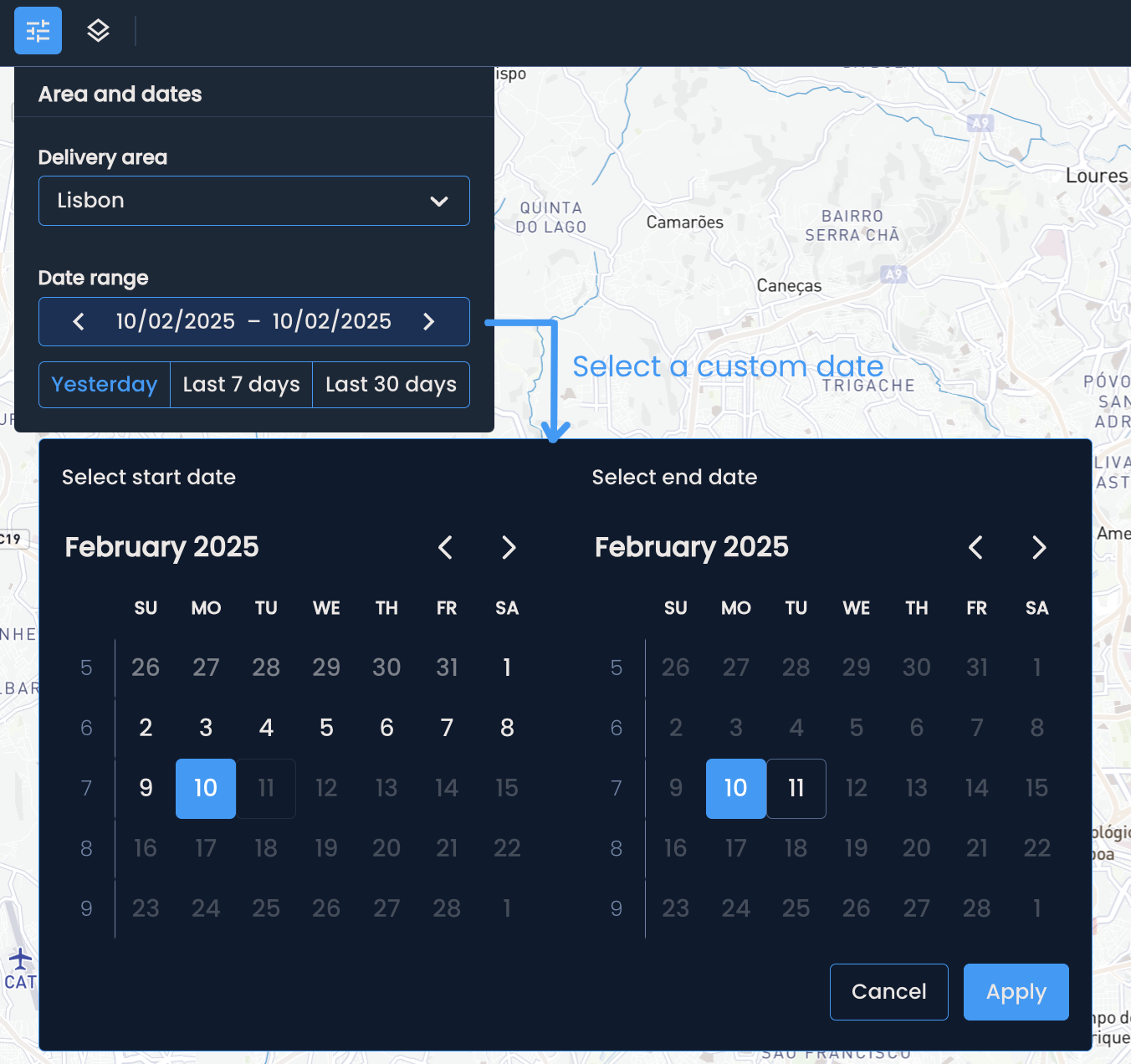
Start by selecting the delivery area you want to analyze.
Choose the desired date range, either by clicking on one of the existing options - yesterday, last 7 days and last 30 days, or define a custom range by clicking the calendar.
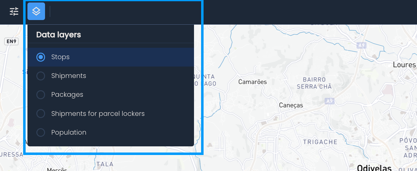
Now, you can change the type of data displayed on the map. Click the Choose the type of data to display button and pick one of the available data layers.

There are two ways the data is visualized on the map:
Heatmap distribution: The heatmap distribution will divide the delivery area into hexagons. Darker shades of hexagons indicate a higher volume of the selected data.
Example: Let's say you chose stops as the data layer. The distribution of stops across the delivery area can tell you where the highest loads are. In these high-volume areas, employing additional couriers or adding parcel lockers and shops to support their efforts could make sense.
Cluster distribution: The cluster distribution aggregated data within the predefined smaller regions inside the delivery area. Darker shades of purple indicate a higher volume of stops, shipments, or other data points within the region.
Example: Let’s say you have returns as an available data layer. By choosing returns and switching to the cluster distribution, you can quickly identify regions with high return volumes. From there, you can investigate the causes—was it a failed delivery attempt, or a customer-initiated return?
Click the Map settings button in the bottom left corner to switch between the heatmap and cluster distribution.
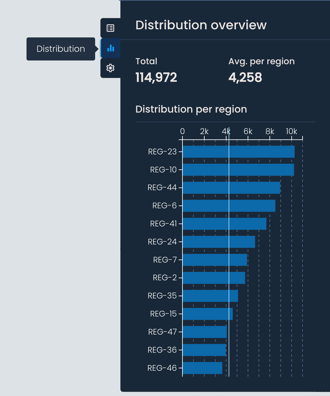
The cluster distribution view can be paired with the Distribution overview panel for a quicker understanding of the data.
The Distribution overview panel opens once you choose the cluster distribution, and it contains the following:
Total - The total count of the selected data layer across the delivery area. For example, if you’ve chosen stops, this will show you the total number of stops in the delivery area for the selected period.
Average per region - The average value across the smaller regions within the delivery area.
Distribution per region (chart) - A bar chart showing the total value of the selected data layer for each region.
Hovering over a bar will highlight the corresponding region on the map.
Clicking on a bar will zoom in on the selected region.