Use the Map Settings button in the bottom-left corner of the map to customize the style of the map and how data is displayed.
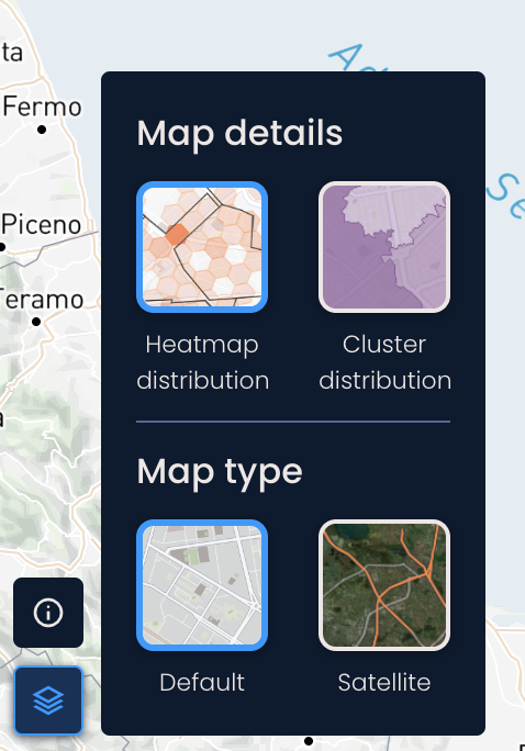
In the Map Details section, you can choose between different data visualization styles:
Heatmap distribution: Divides the delivery area into hexagons. Darker shades of hexagons indicate a higher volume of the selected data.
Example: If you select population as a data layer, areas with higher population density will be shown using darker shades.
Cluster distribution: Aggregates data within predefined smaller regions of the delivery area. Each region is shaded based on the volume of data it contains, with darker shades indicating higher volumes.
Example: Let’s say you have returns as an available data layer. By choosing returns and switching to the cluster distribution, you can quickly identify regions with high return volumes.
In the Map Type section, you can switch between:
Default map type: A terrain/street-focused view with roads, landmarks, and labels.
Satellite: Displays satellite images of real-world locations.