The OOH point analysis page offers an overview of individual parcel locker and shop performance during a specific week.
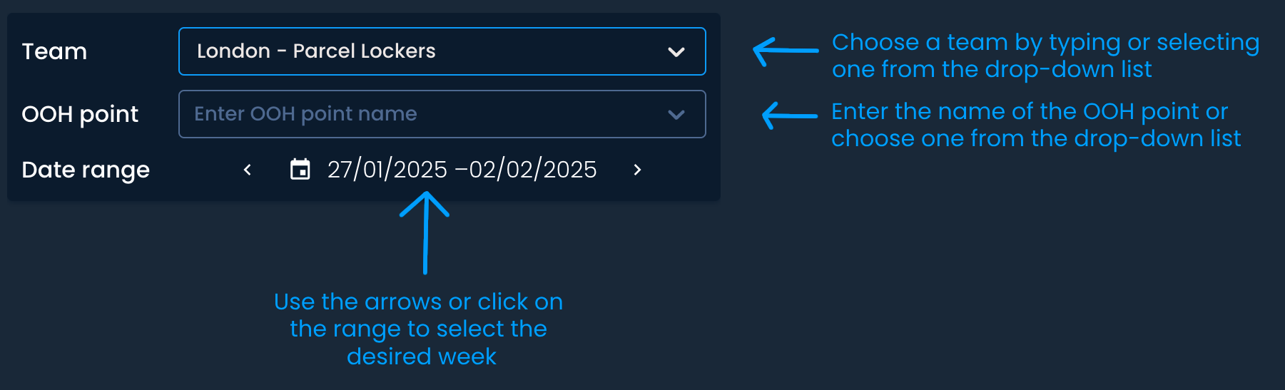
First, choose the Team, OOH point, and date range you want to analyze.

On the left side, you will find:
Details about the OOH point:
ID - A unique identifier for each locker or shop in your system.
Capacity - The total storage capacity of the OOH point.
Activation date - The date the OOH point was activated.
Working hours - The operating hours of the OOH point.
An overview of performance metrics (collections, unsuccessful, pickups, utilization rate)
Interactive charts visualizing breakdowns

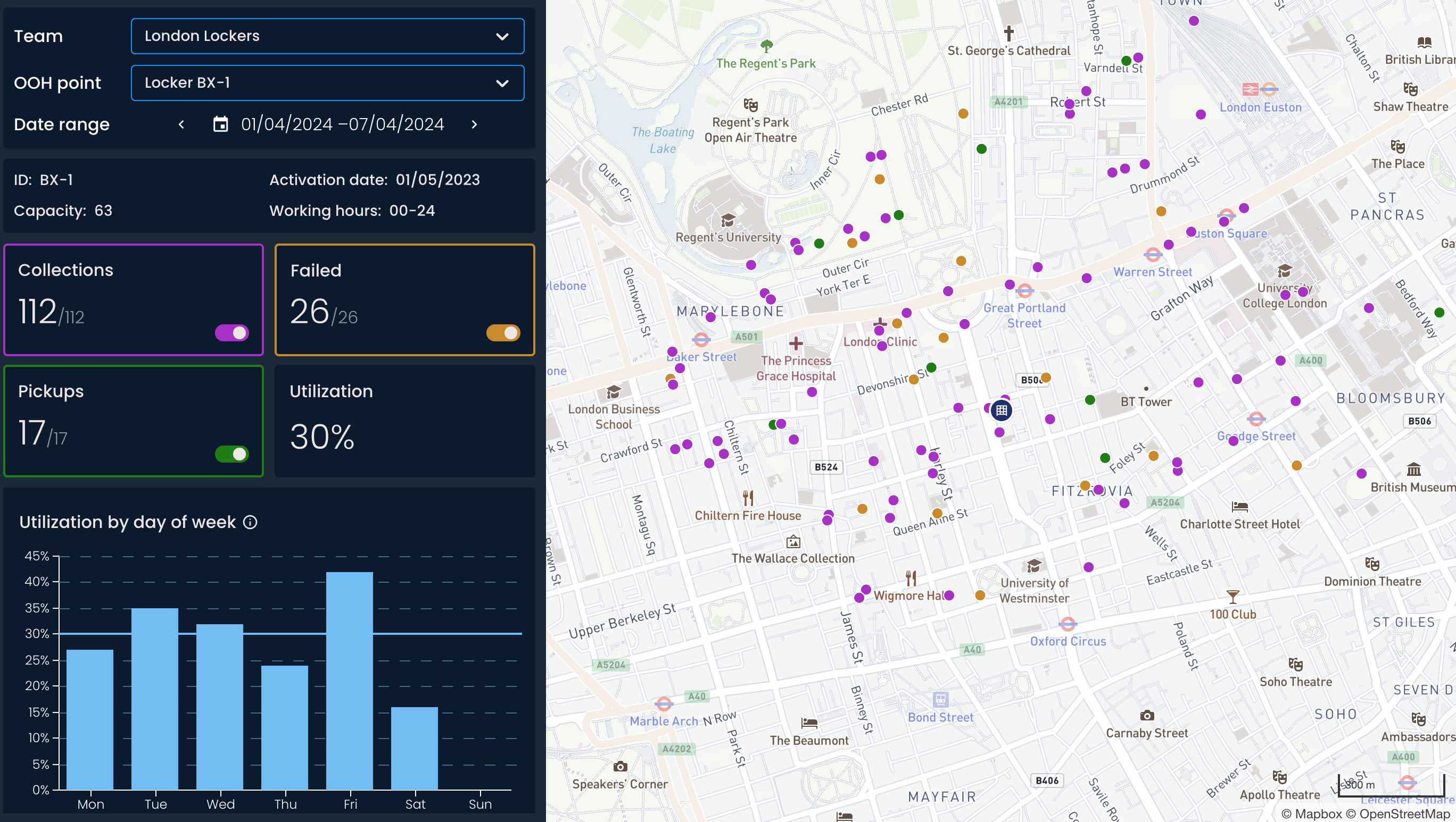
The number of shipments picked up from a parcel locker or shop by recipients.
The number of shipments that recipients didn’t collect during the defined storage period.
The number of shipments "received" by the locker or shop for further processing. This can include:
Returns: Shipments dropped off by recipients at the locker or shop, which will be sent back to the sender (e.g., a return to a retailer).
Outgoing shipments: Shipments dropped off at the locker or shop to be sent to another location.
The ratio of the number of parcels delivered to an out-of-home point and its total capacity.
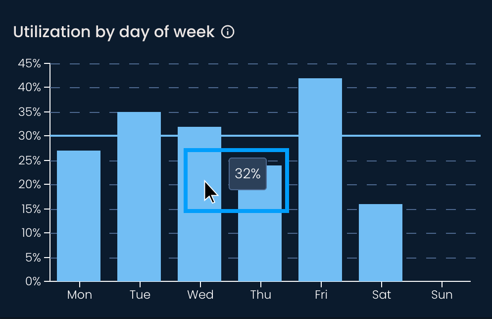
The bar chart shows the distribution of the OOH point daily utilization rate for the chosen week. Hover over each bar to see the exact percentage.
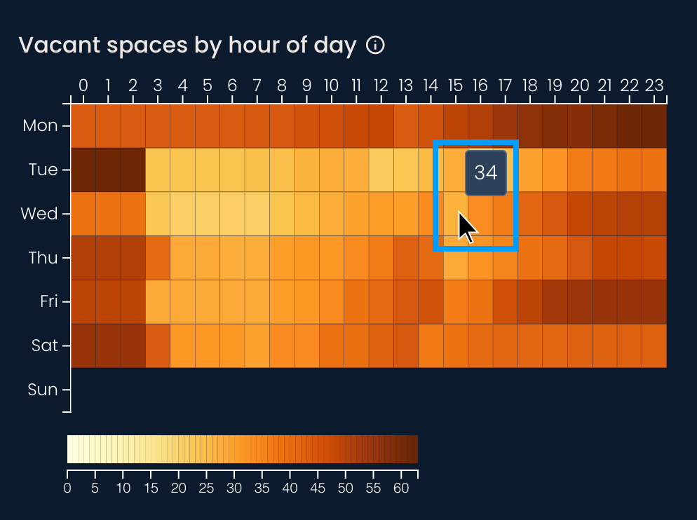
The cells in the heatmap display the number of empty spaces for a given day and hour. Darker shades indicate greater vacancy. Hover over each cell to see the exact number.
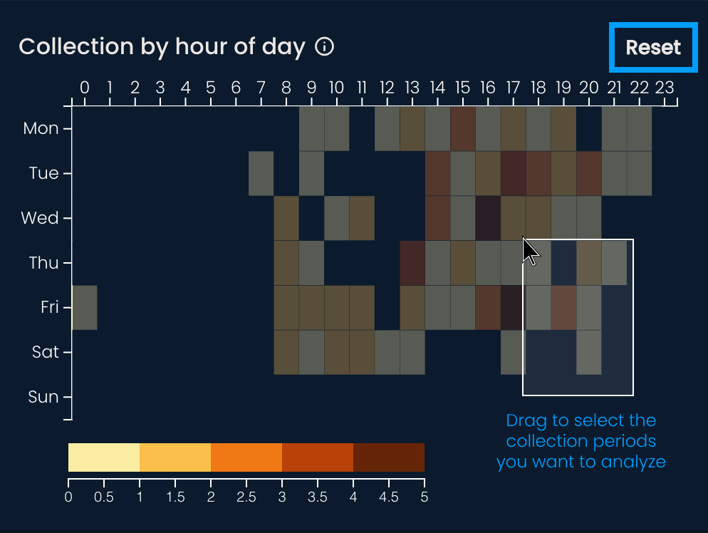
The cells in the heatmap show the number of collected shipments for a given day and hour. Darker shades indicate large numbers of collected shipments.
If you’re interested in a certain period, drag the cursor across the heatmap to select it. This will filter the data that appears on the graphs and the map. Click outside the heatmap cells or press Reset to return to the initial state.
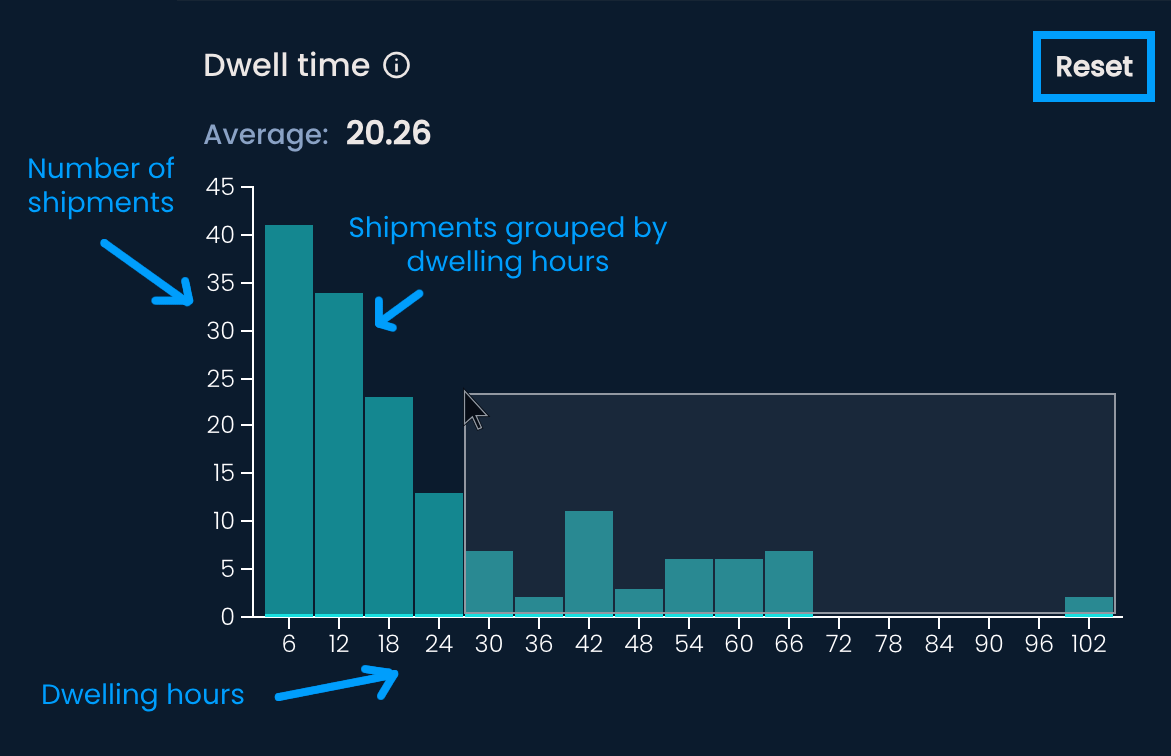
The chart displays the number of shipments grouped by the time spent at the OOH point before being collected or marked as unsuccessful. Hover over each bar to see the exact number of dwelling shipments.
If you want to analyze a specific group of shipments, select them by dragging your cursor across the chart. This will filter the data that appears on the graphs and the map. Click outside the bars or press Reset to return to the initial state.
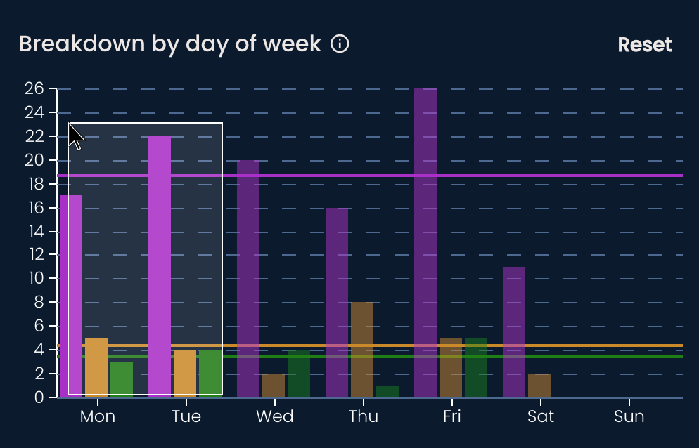
The bar chart shows the daily distribution of collections, unsuccessful shipments, and pickups throughout the week. As with the previous two charts, you can hover over the bars to view the exact number of each shipment type or select the data you're interested in.
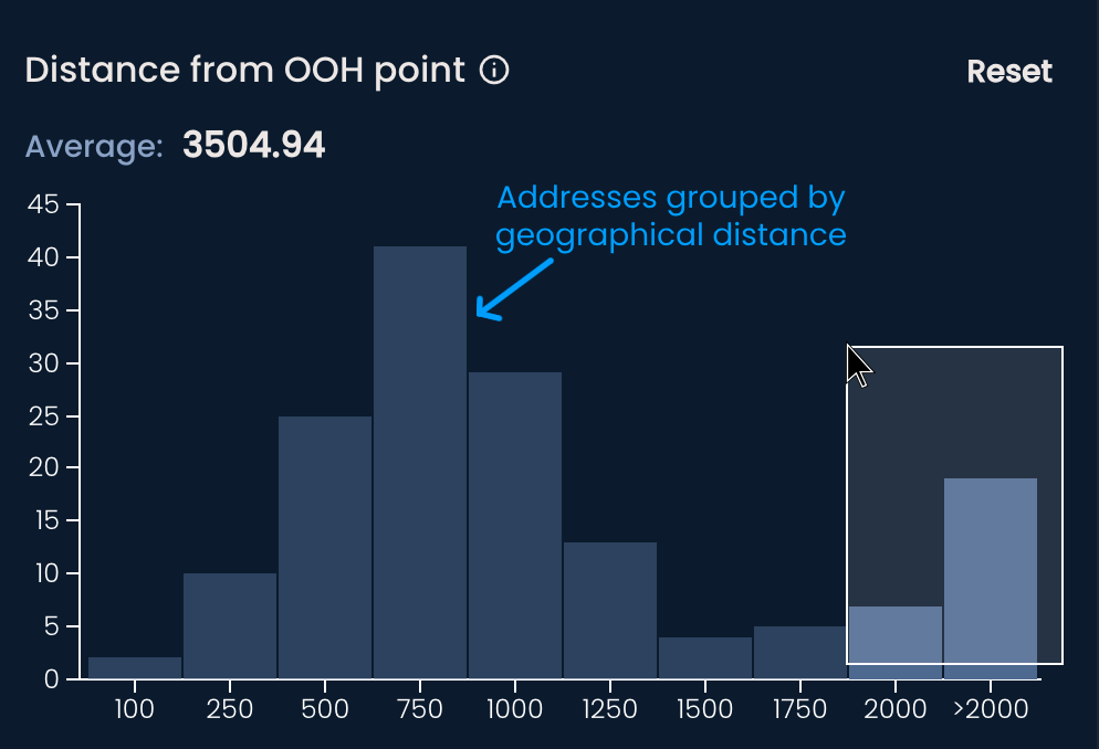
The histogram shows the number of addresses from which recipients placed orders, grouped by their distance from the OOH point. The distance is measured in meters.
You can also hover over the bars to see the exact number of addresses or filter data by selecting specific bars.
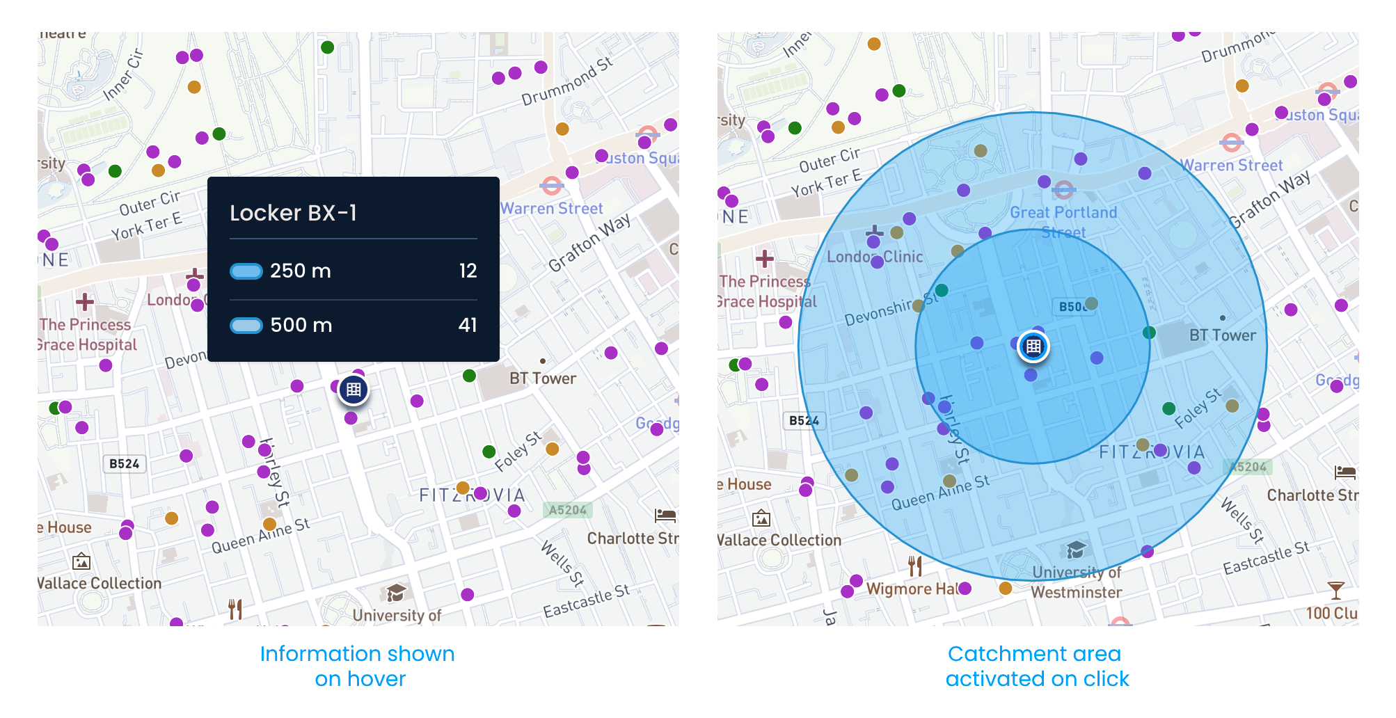
All shipments are visualized on the map at the locations where the orders were placed.
Click on them to see more information:
Shipment code, which can be copied
Date and time a shipment was collected, picked up, or marked as unsuccessful
Address from where the order was placed (if available)
Dwell time
Distance from the recipient’s address to the OOH point (if available)
Hovering over the parcel locker or shop icon will show you how many shipments are within a 250 to 500 meter radius. Clicking the icon will activate a visual representation of the distance radius, also known as the catchment area.